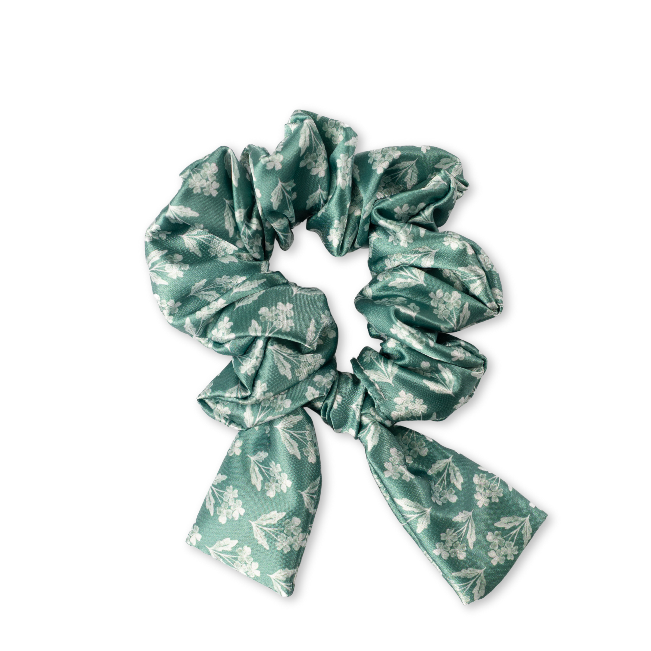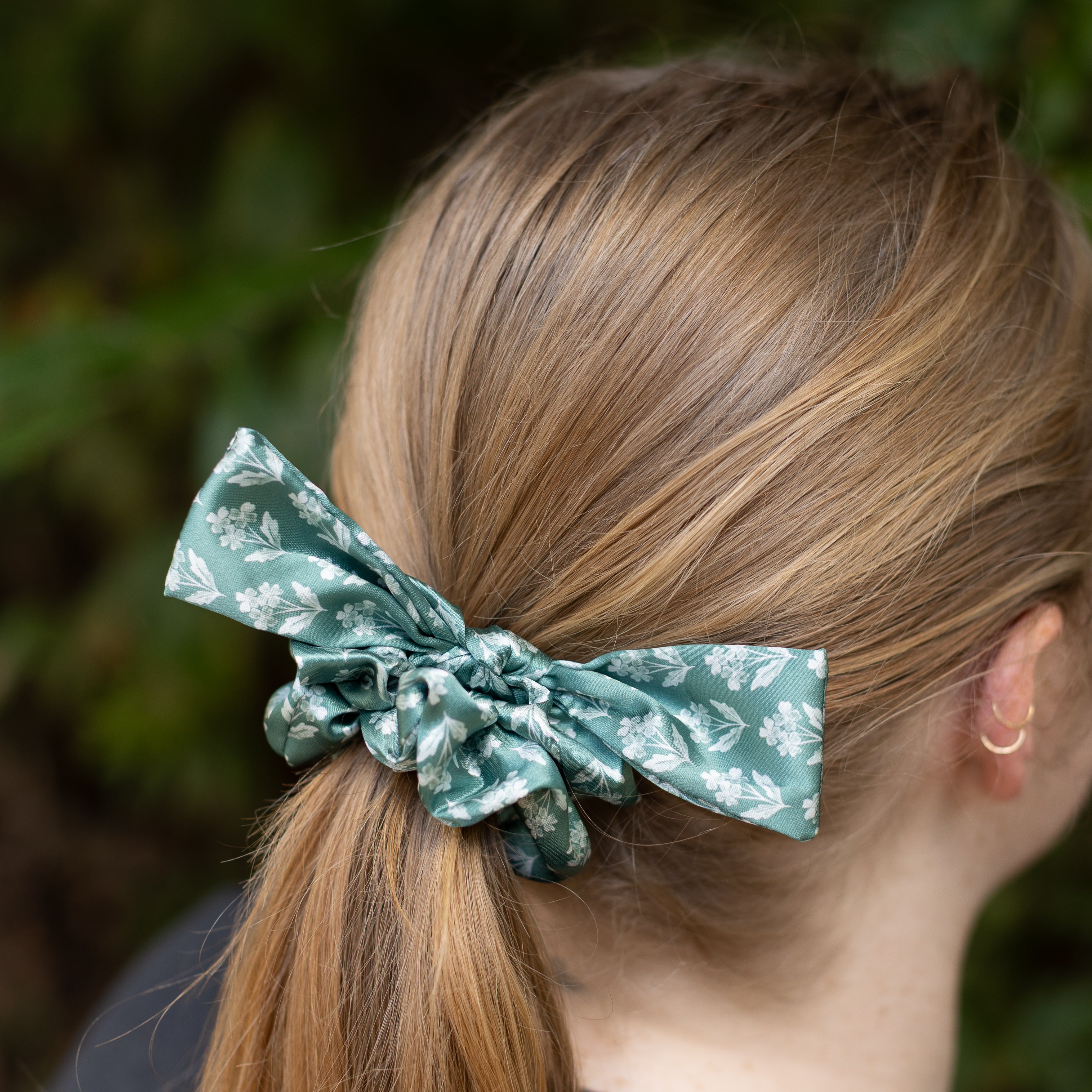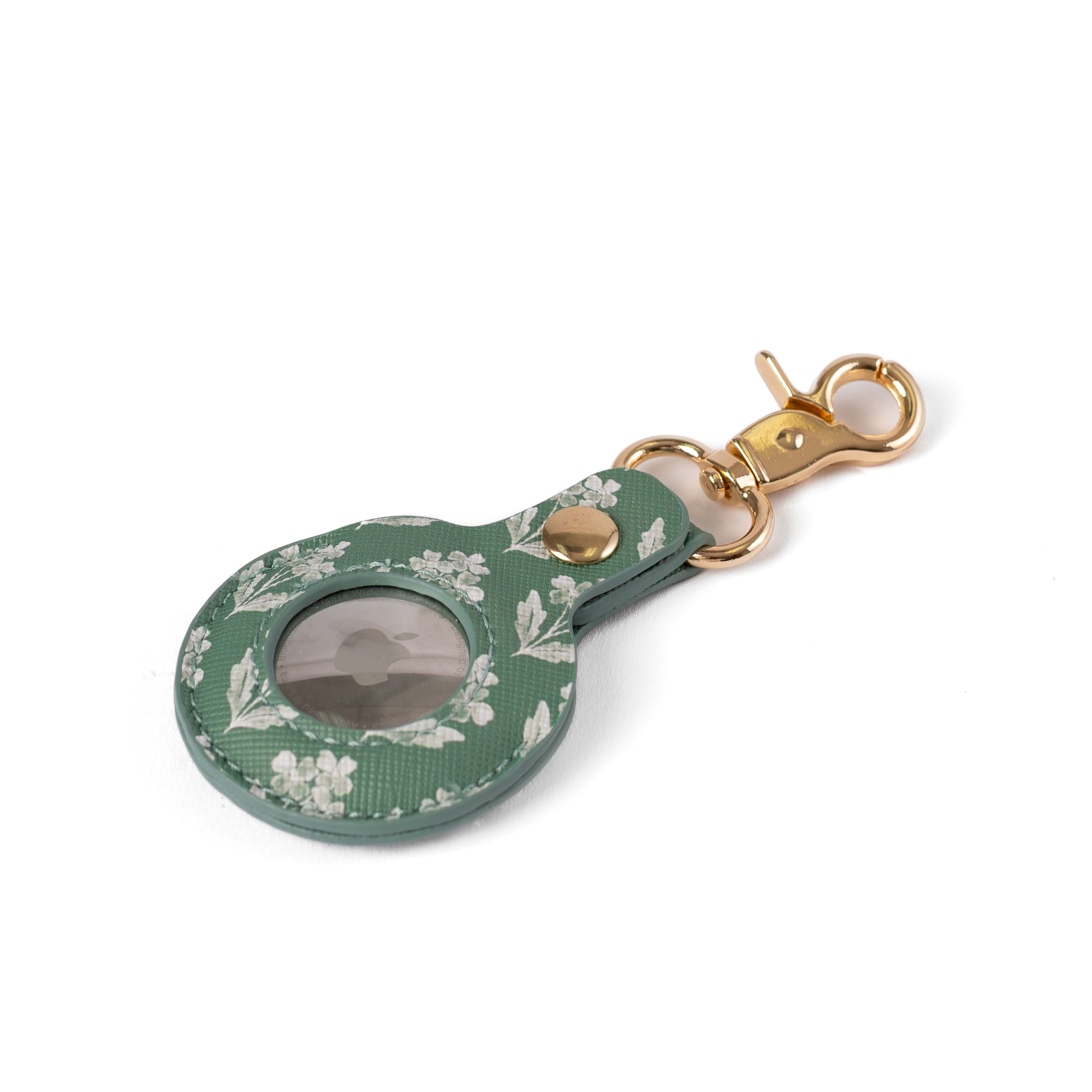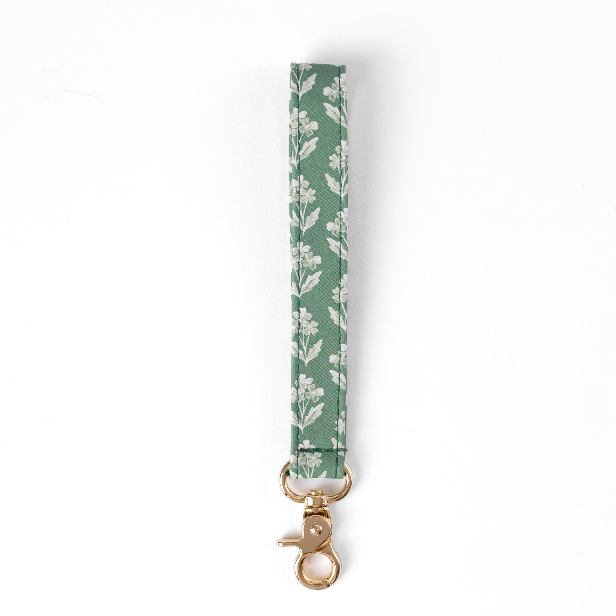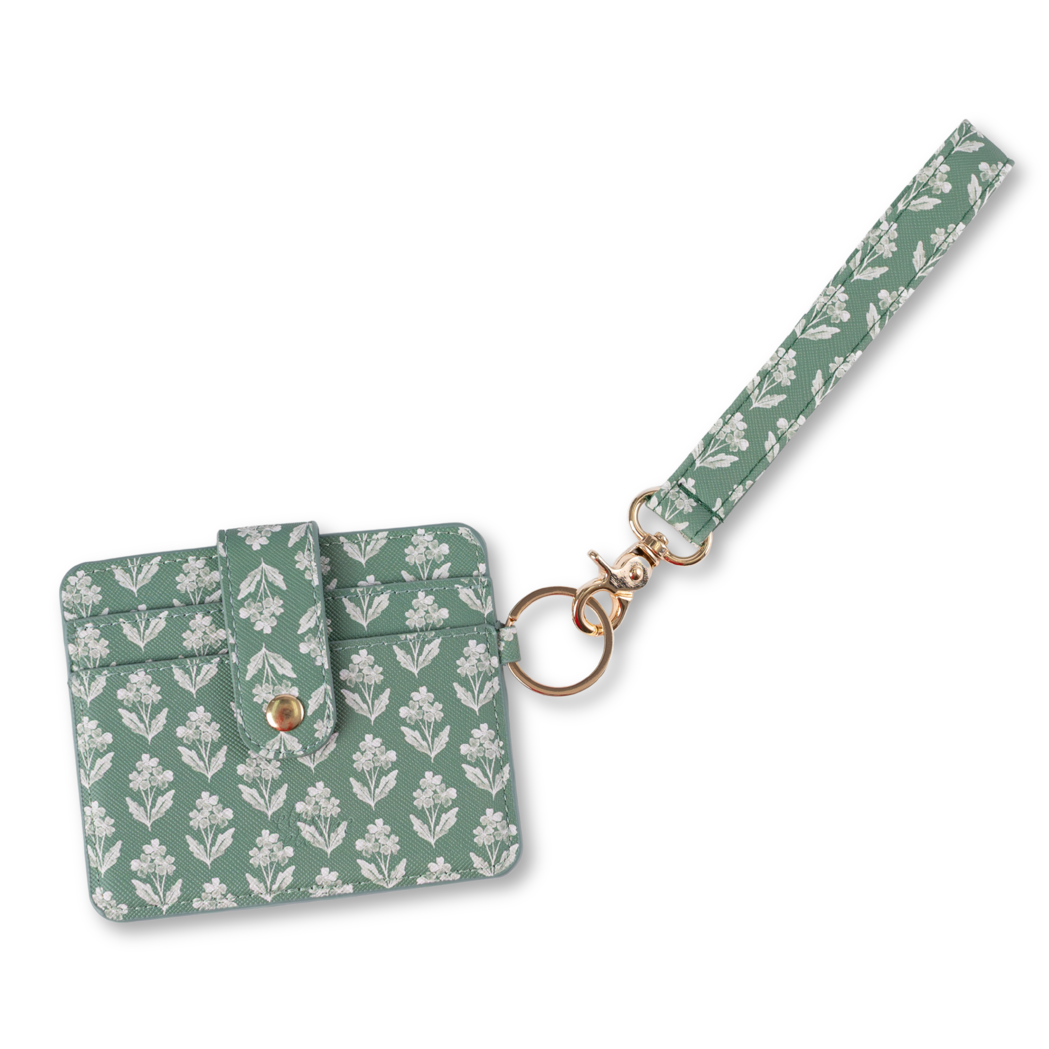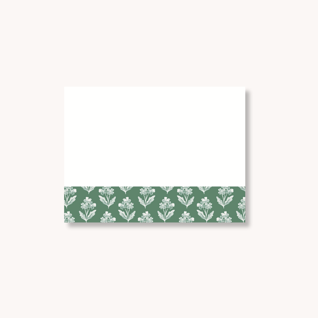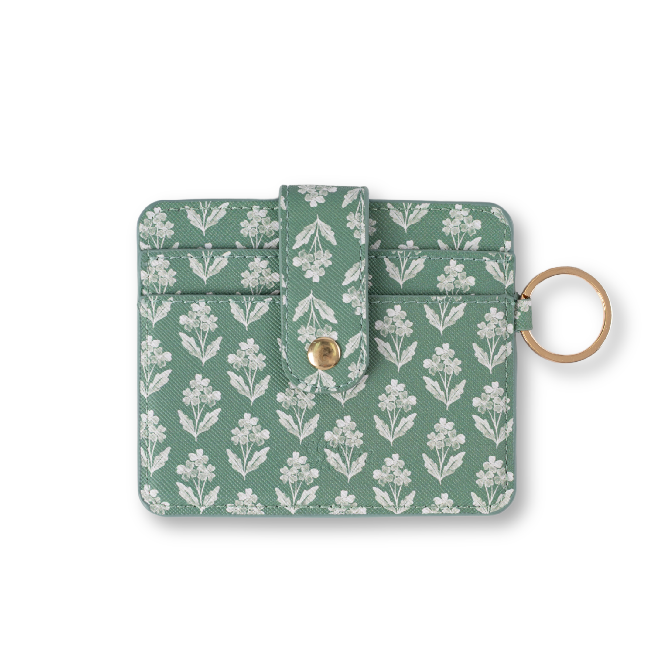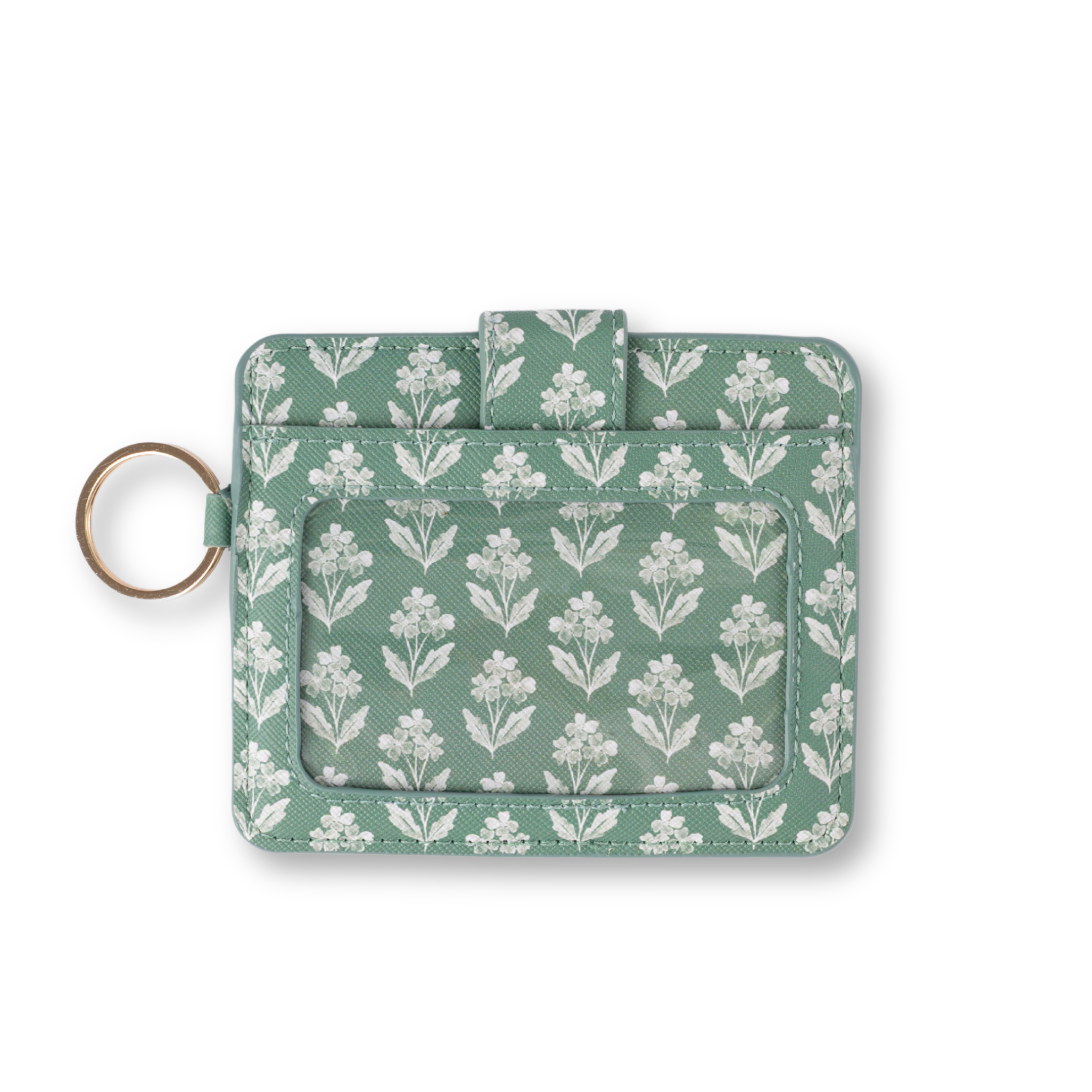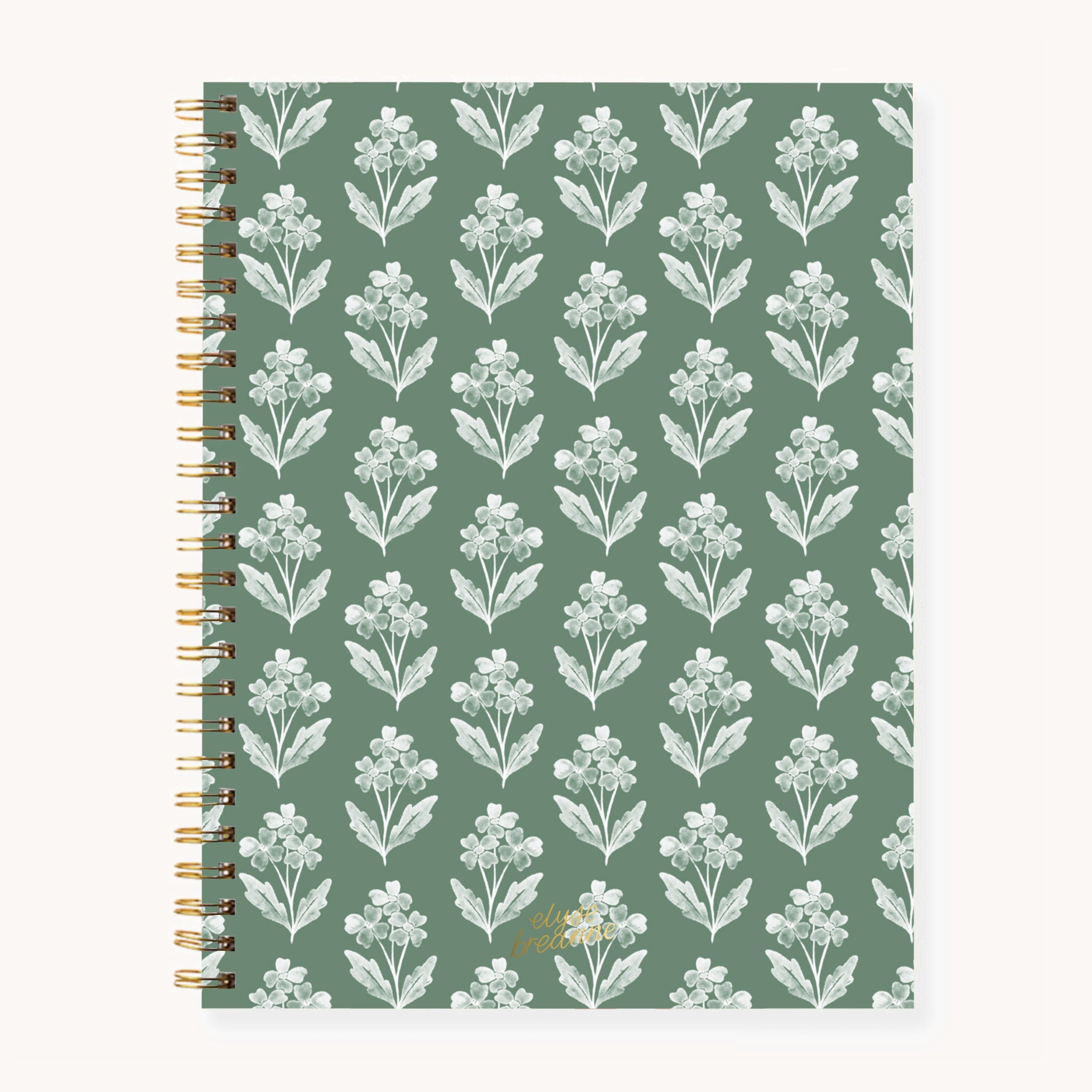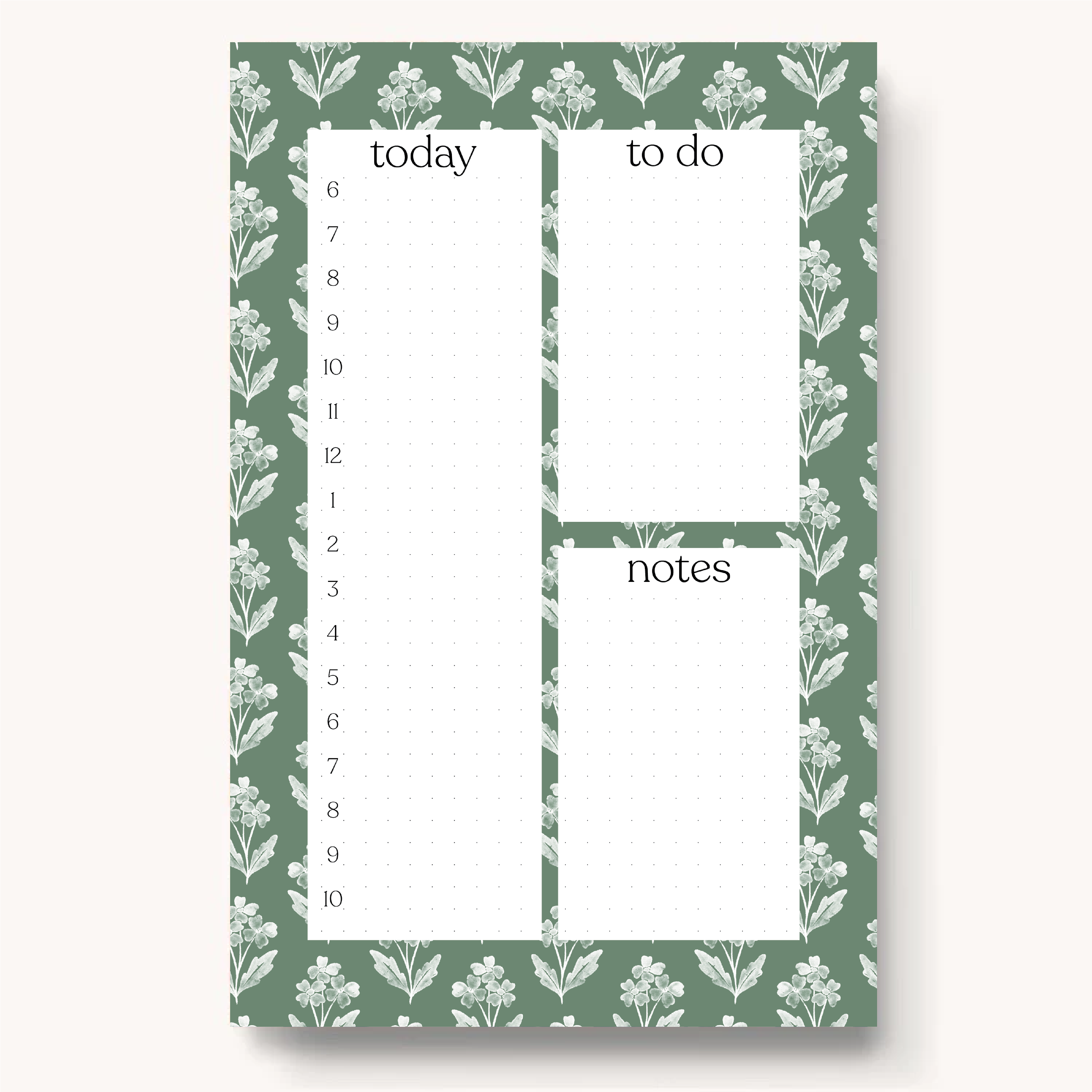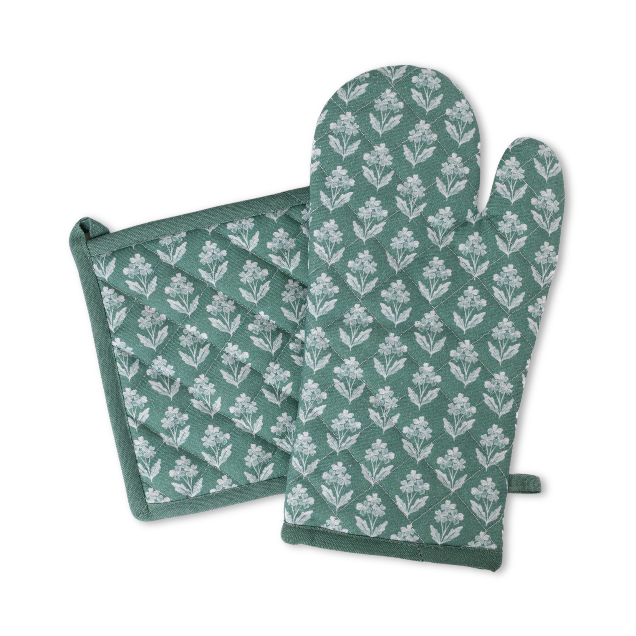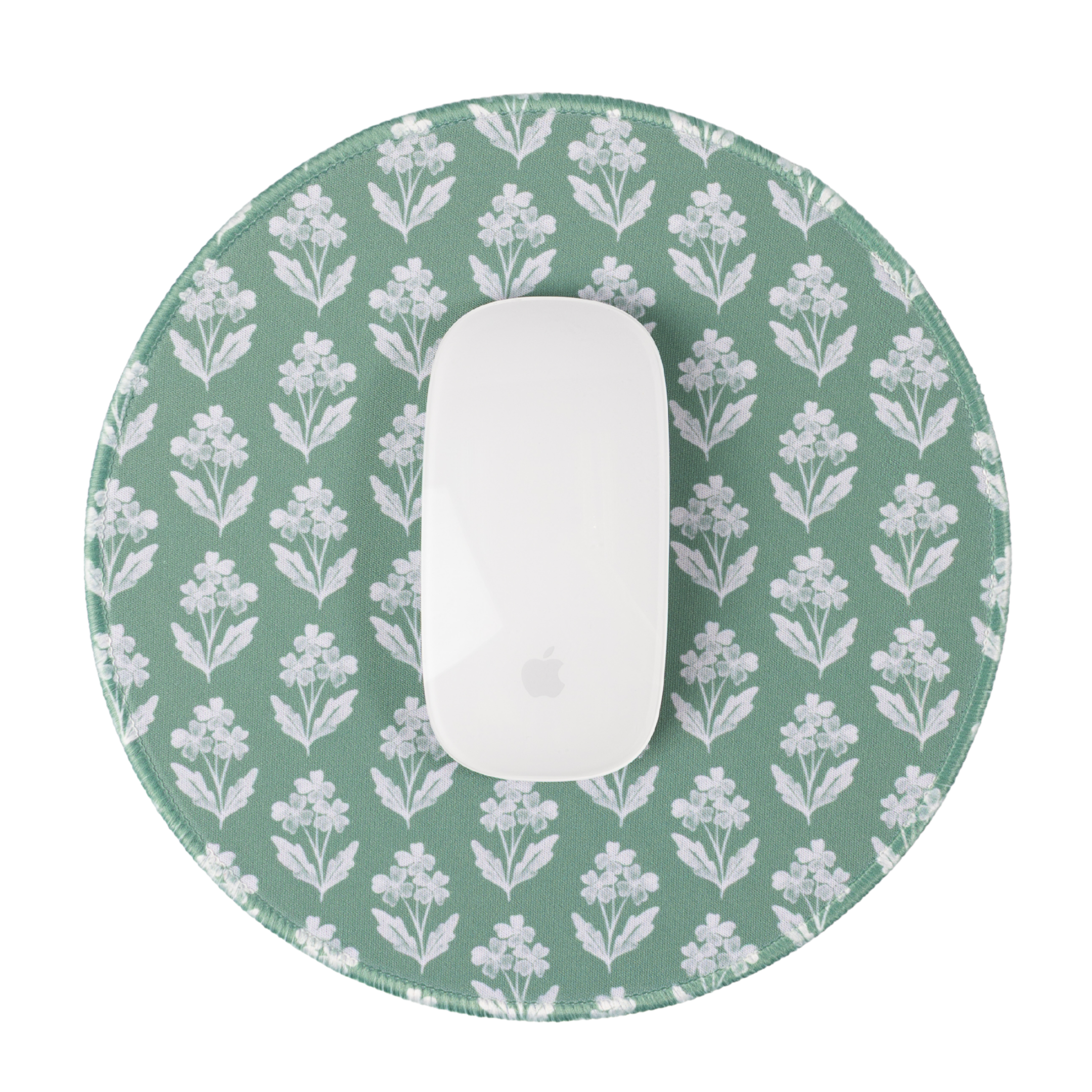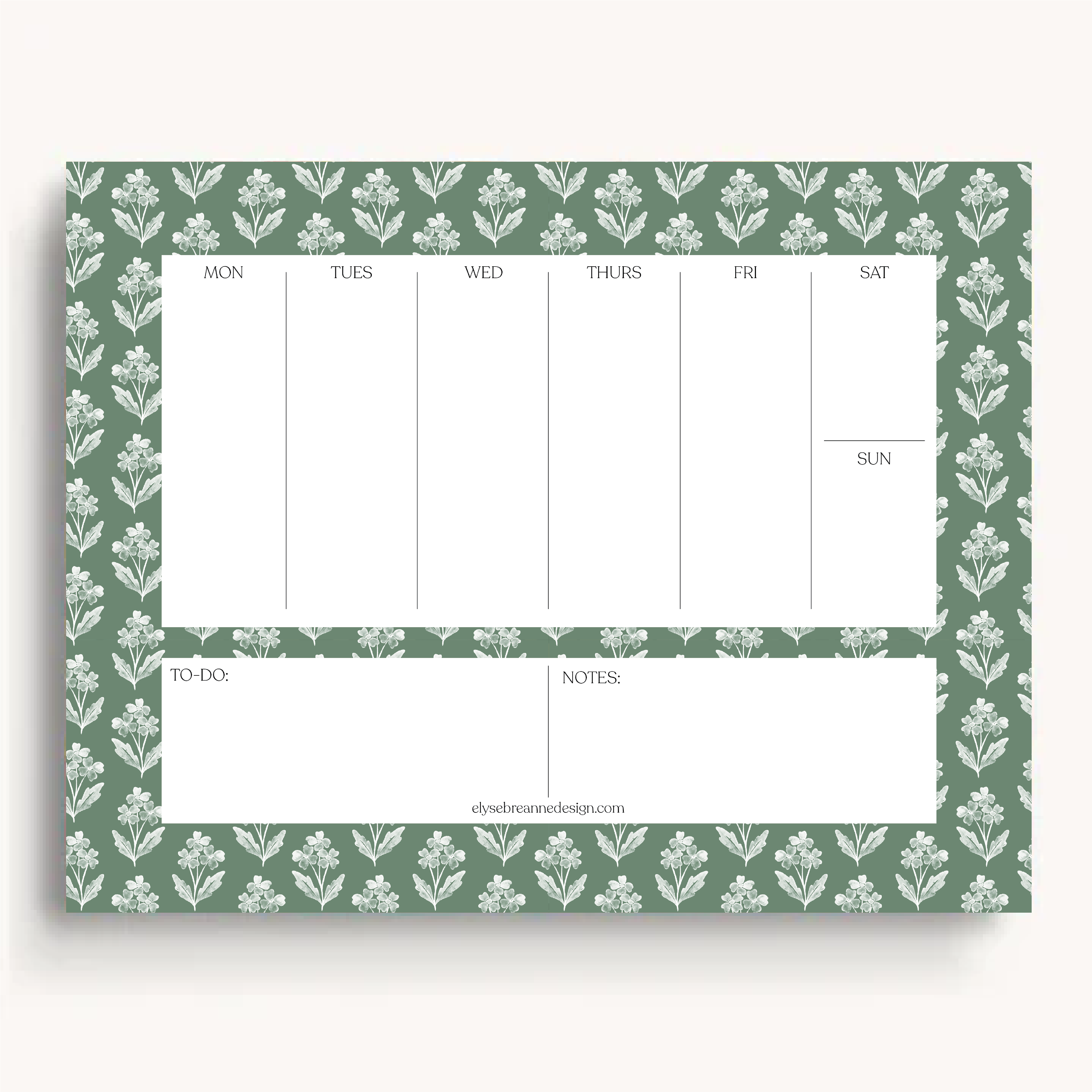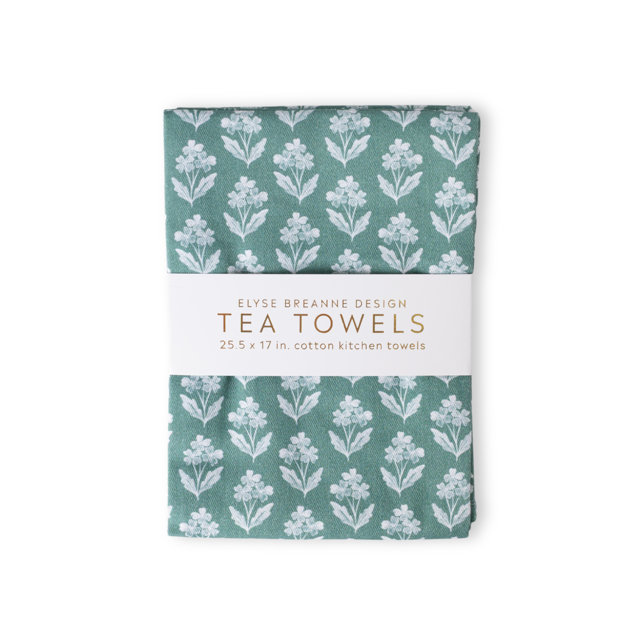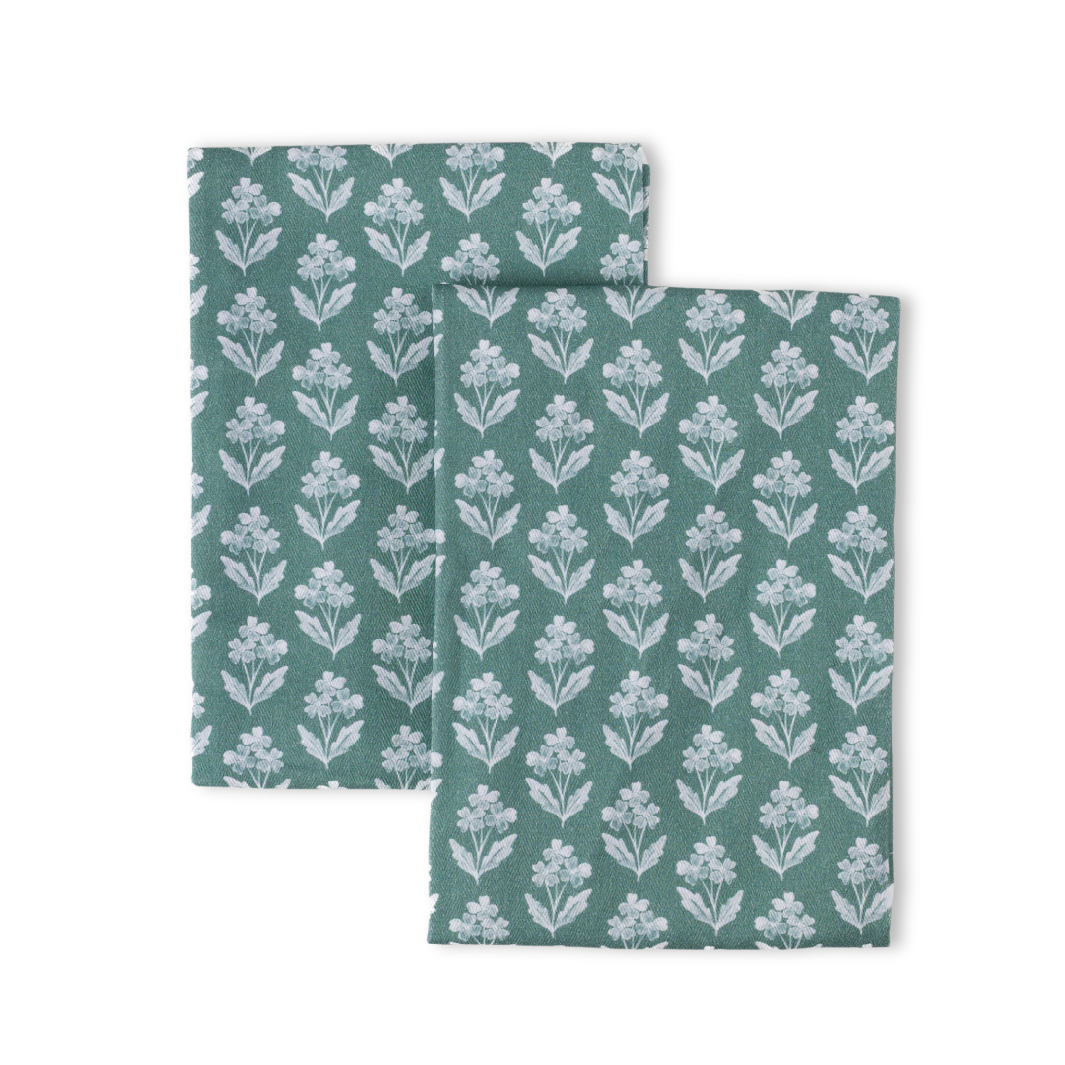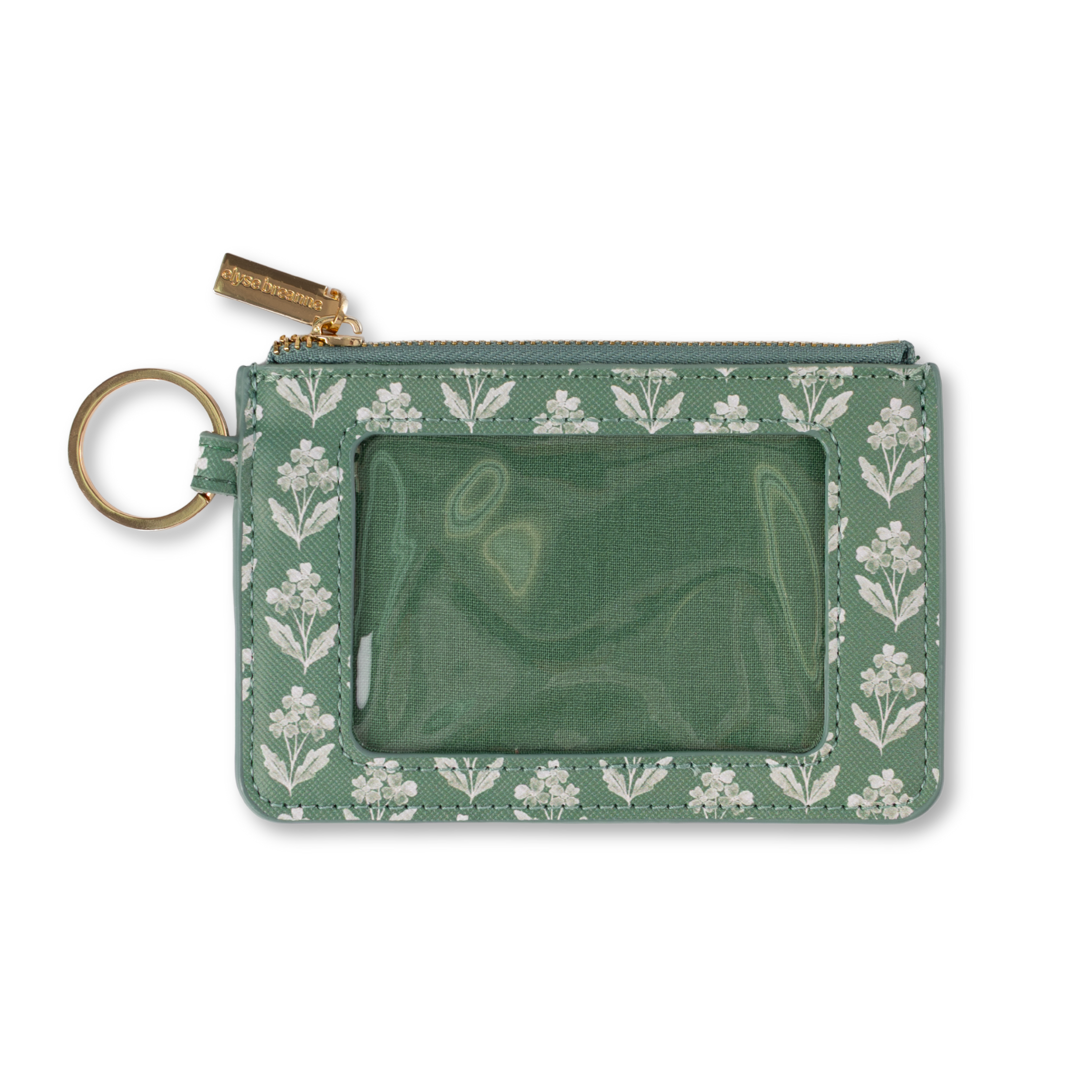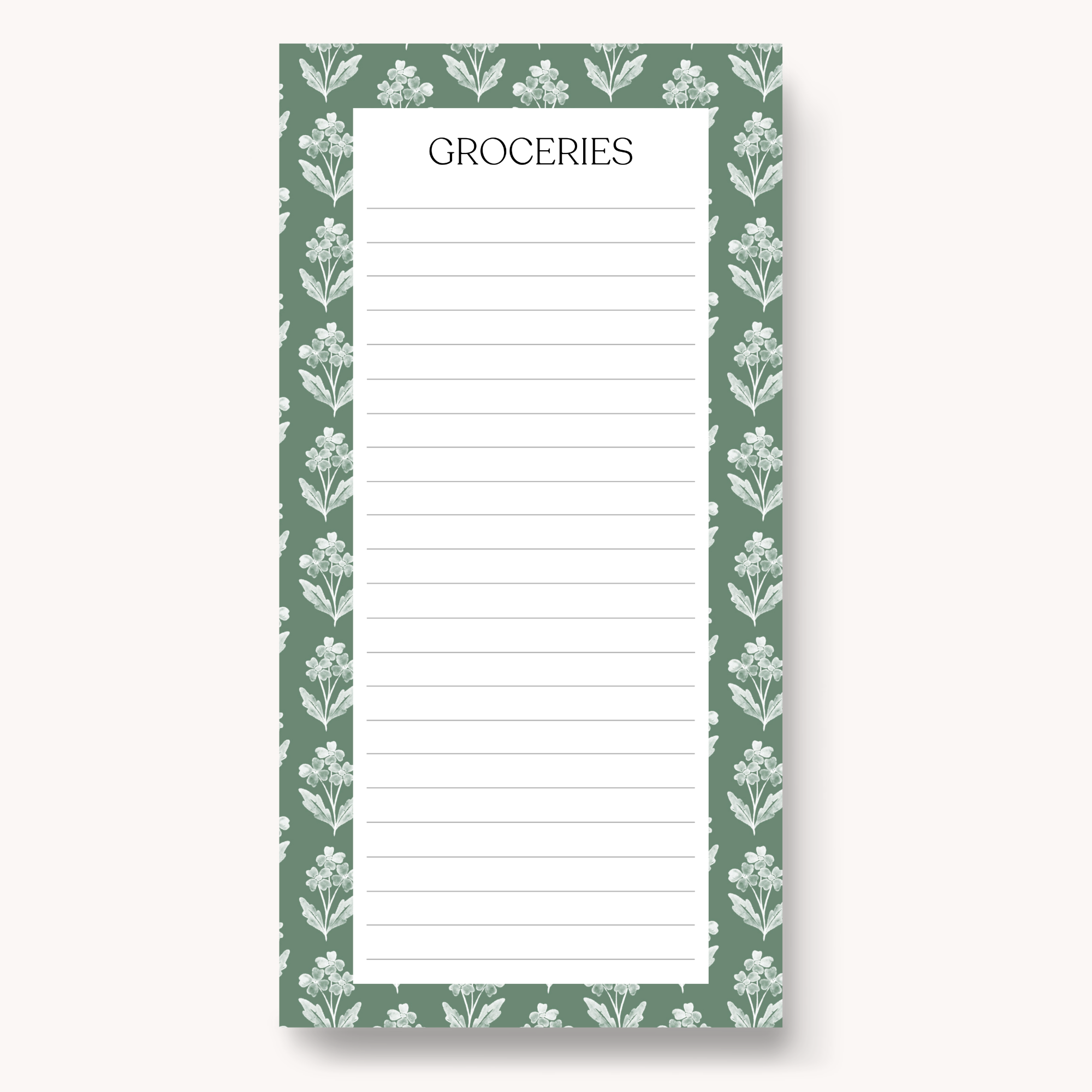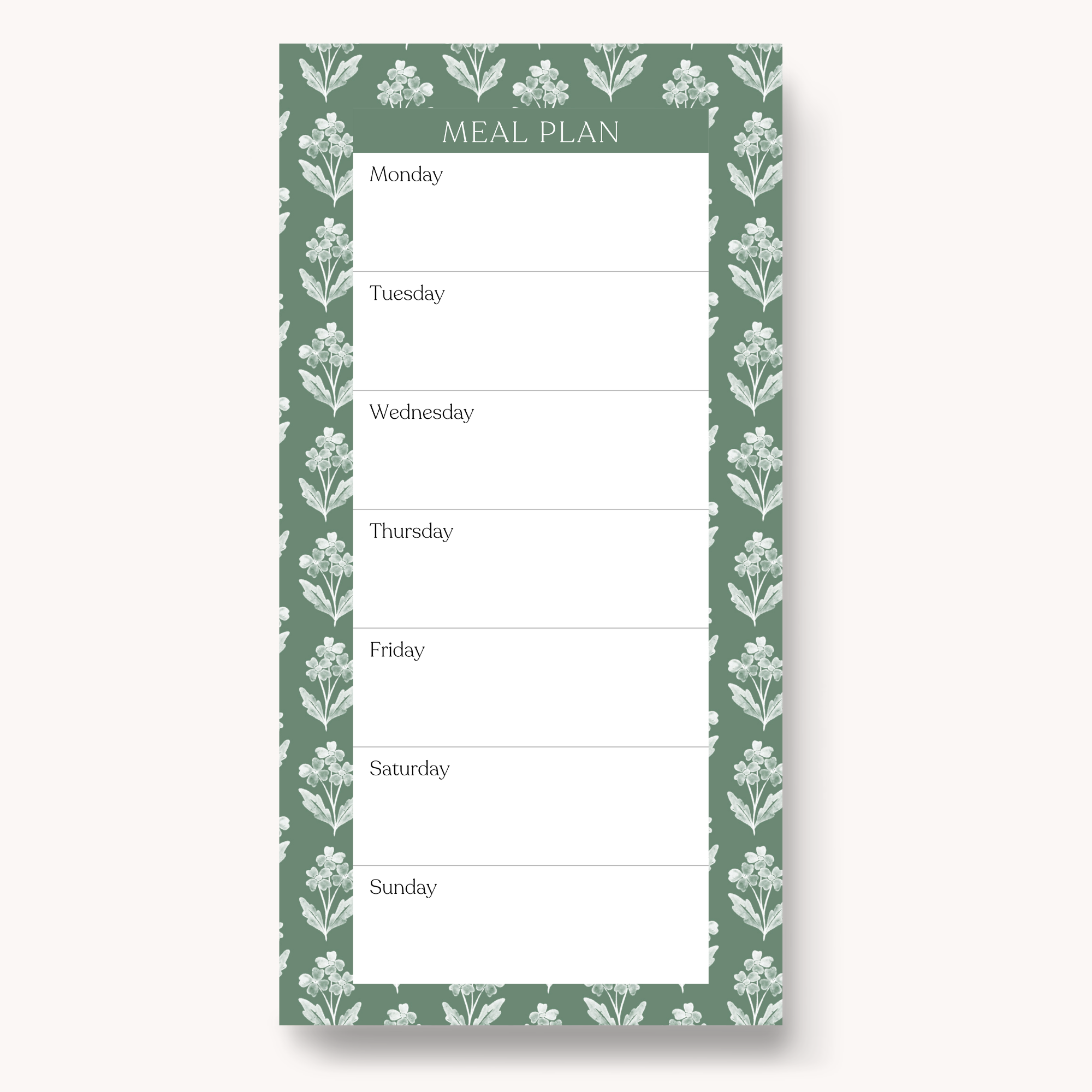
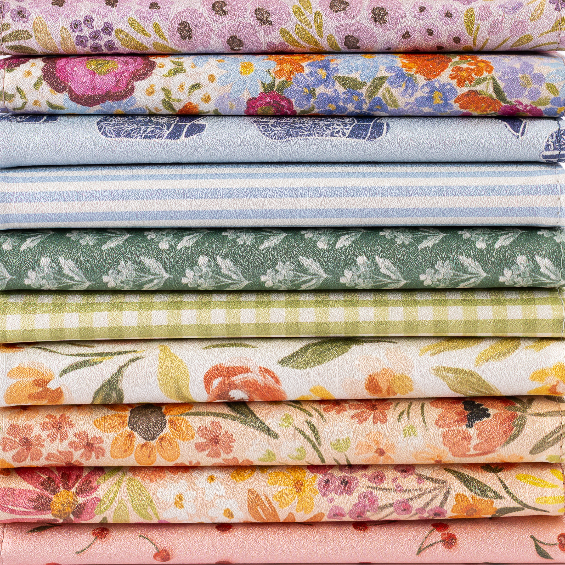


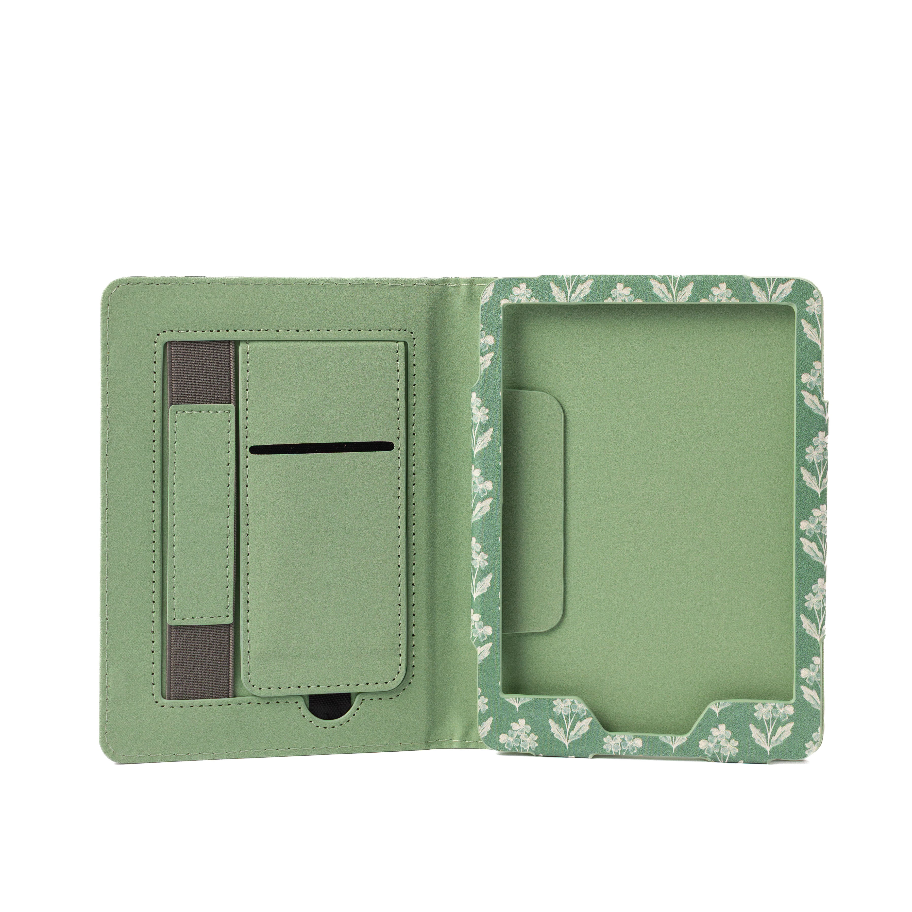


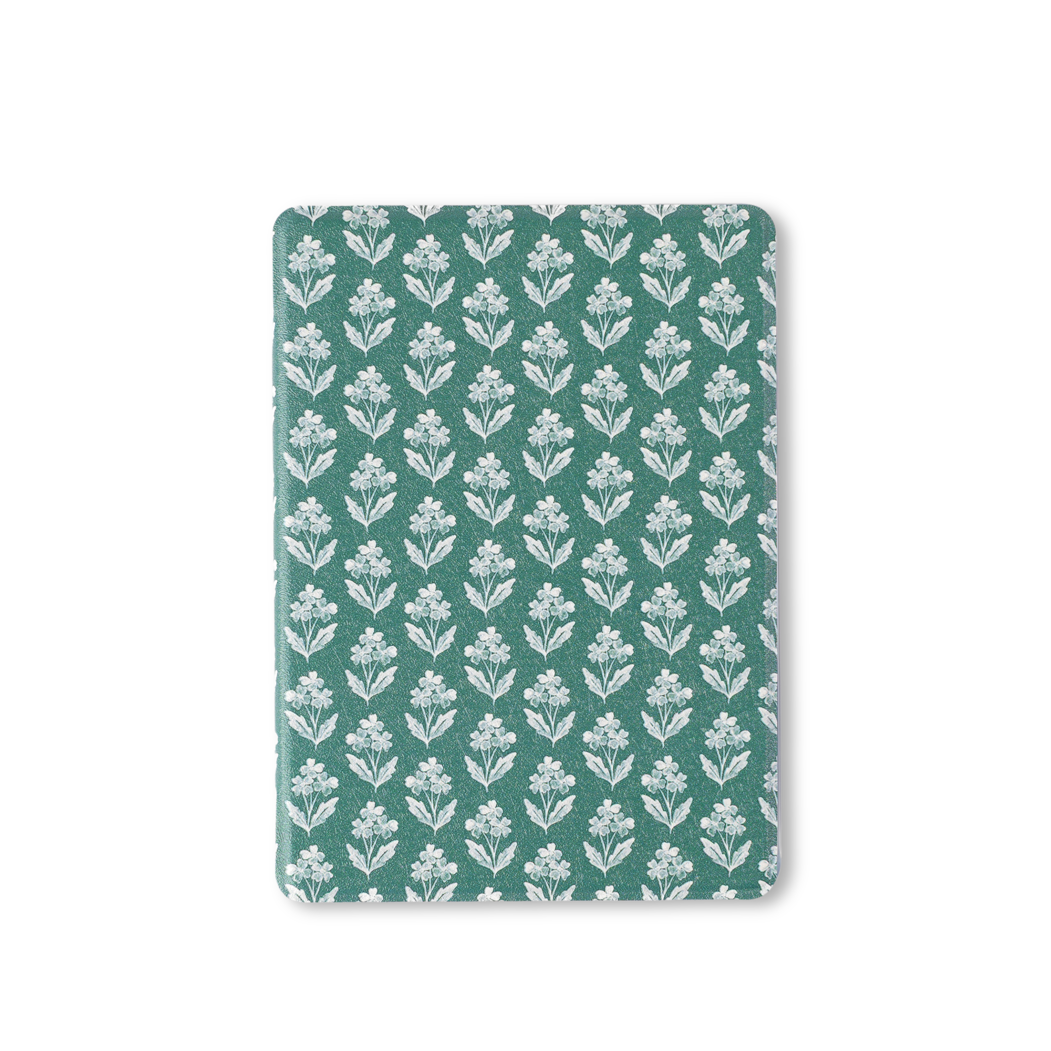


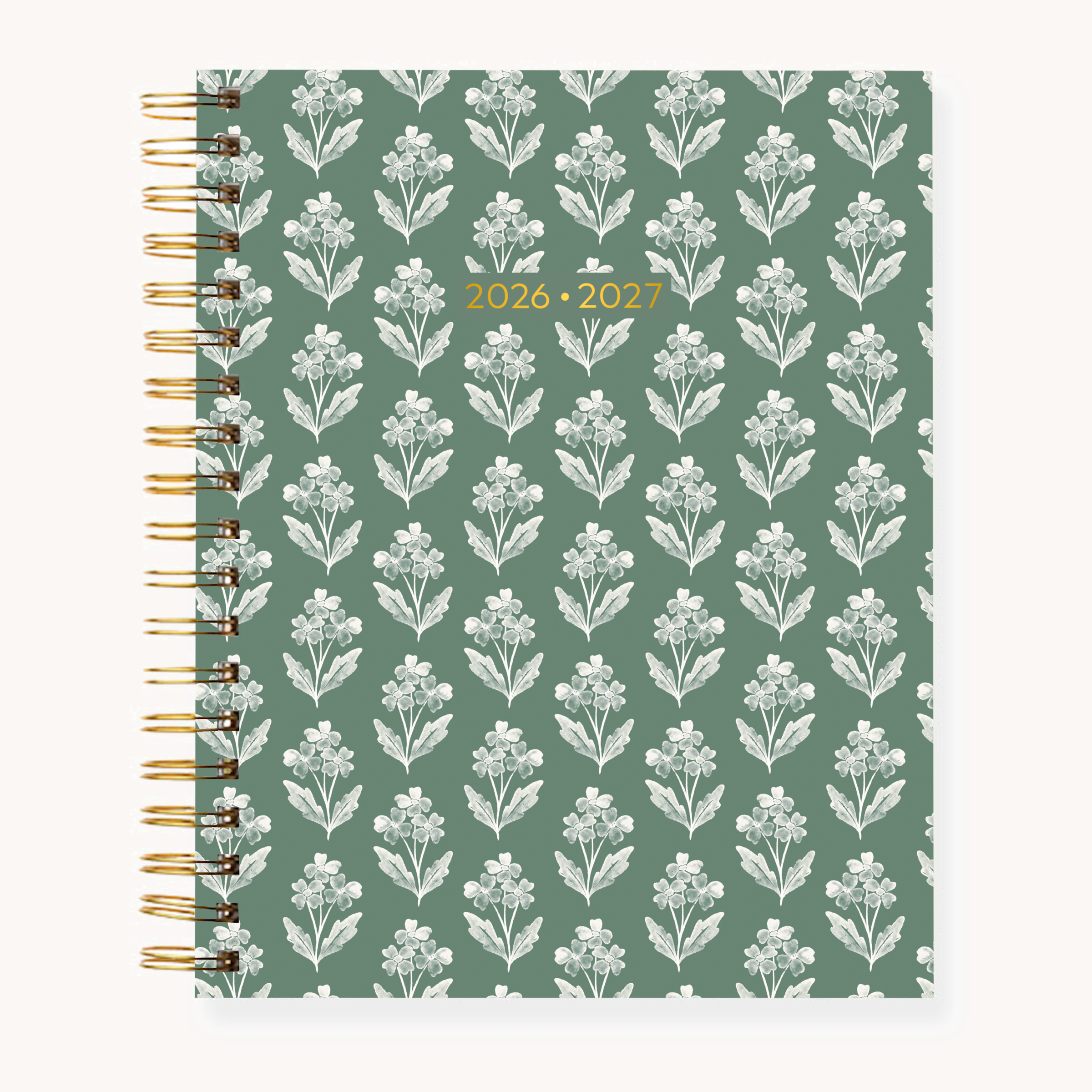

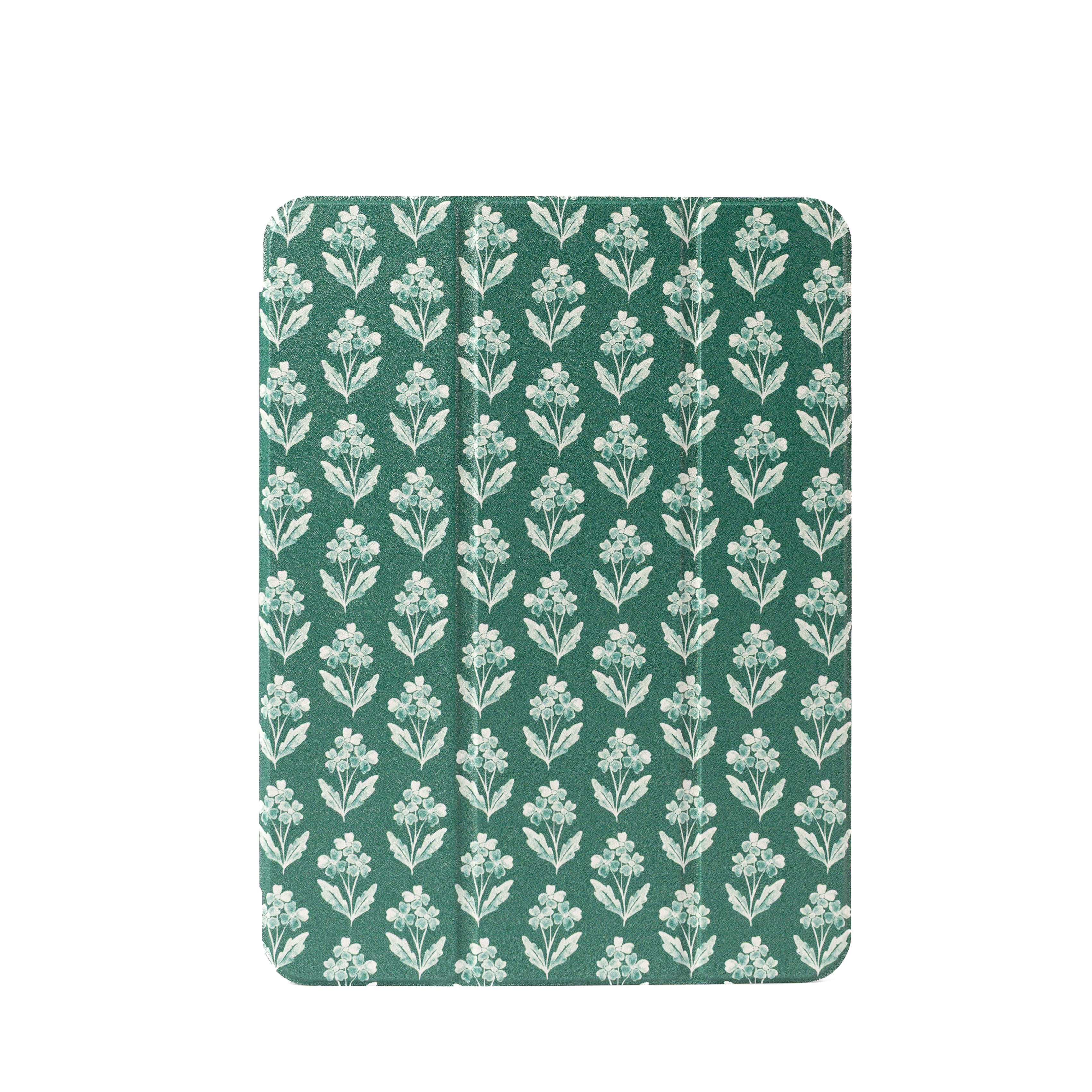
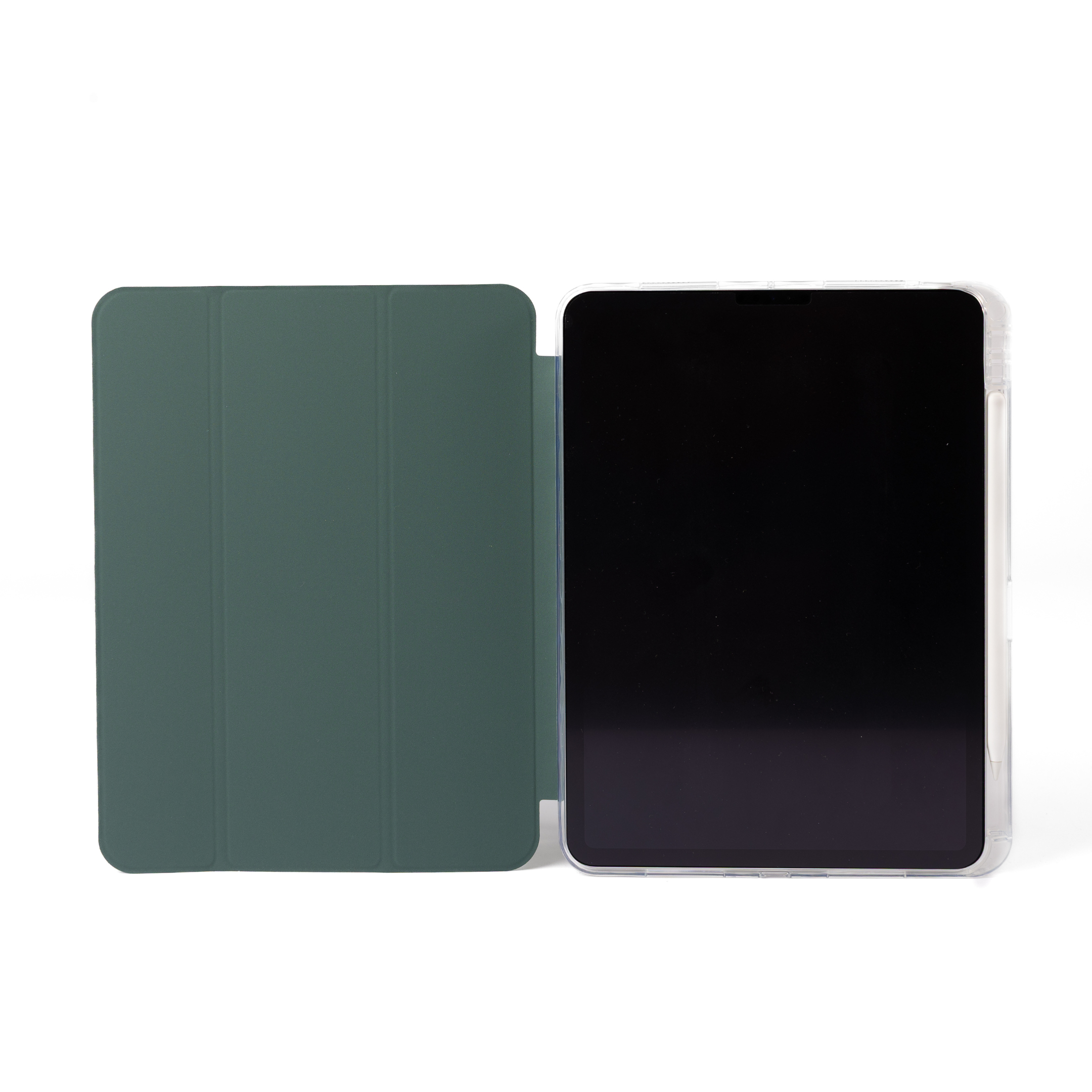

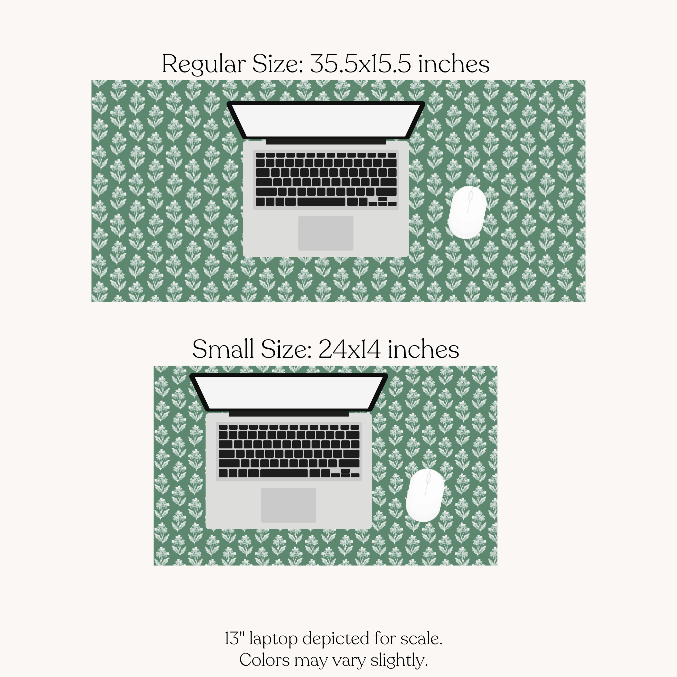
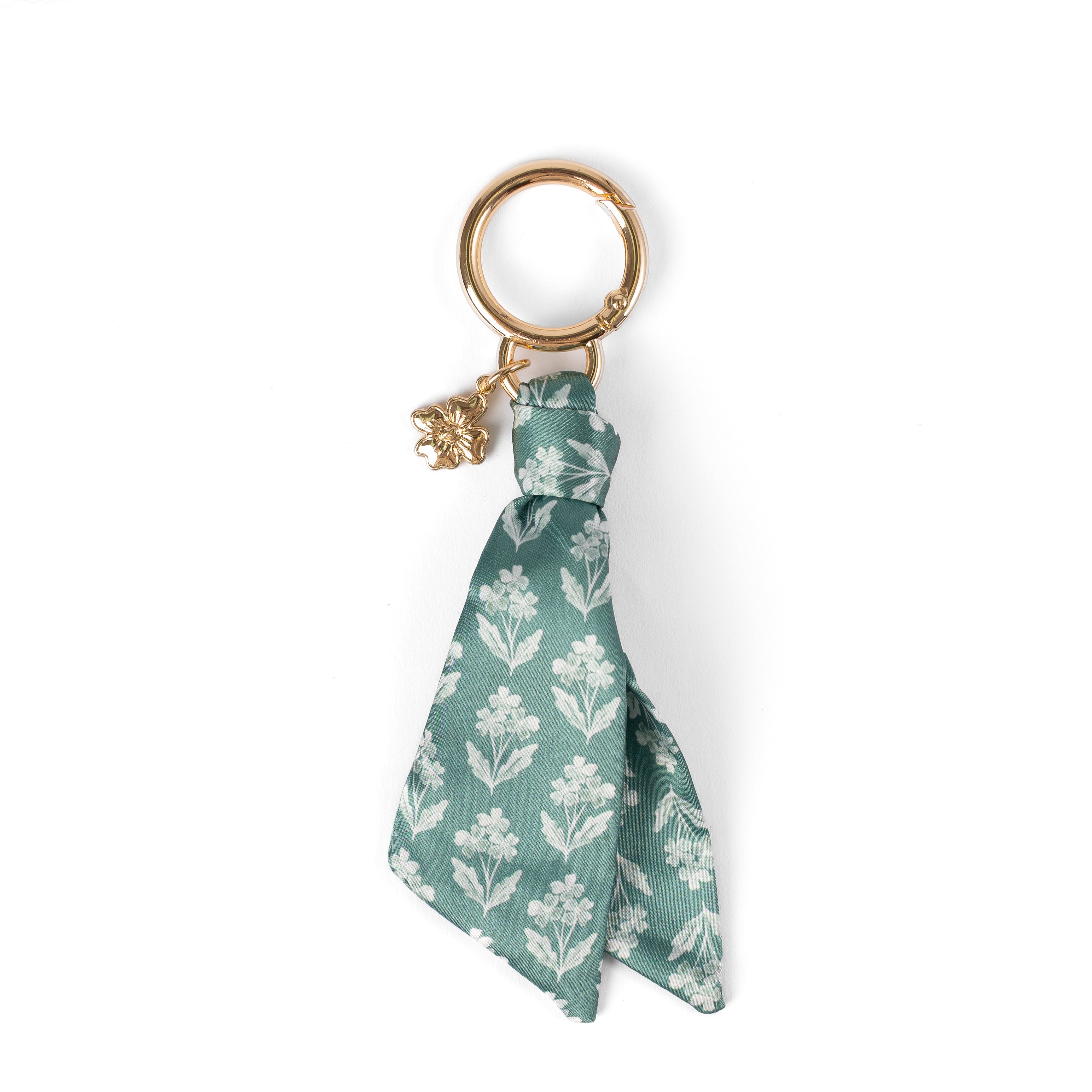
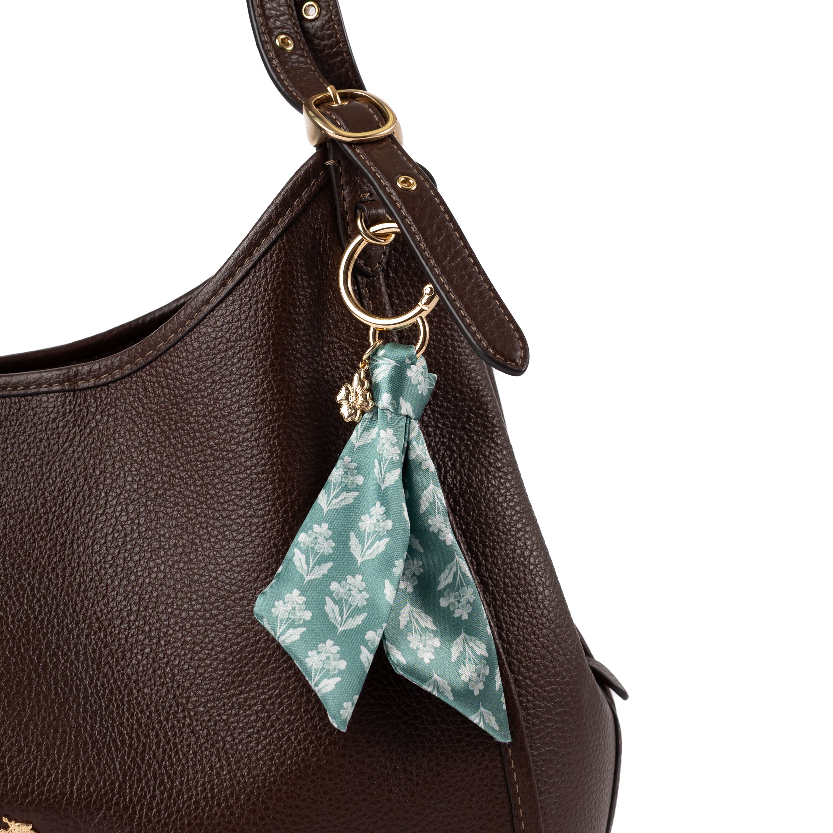
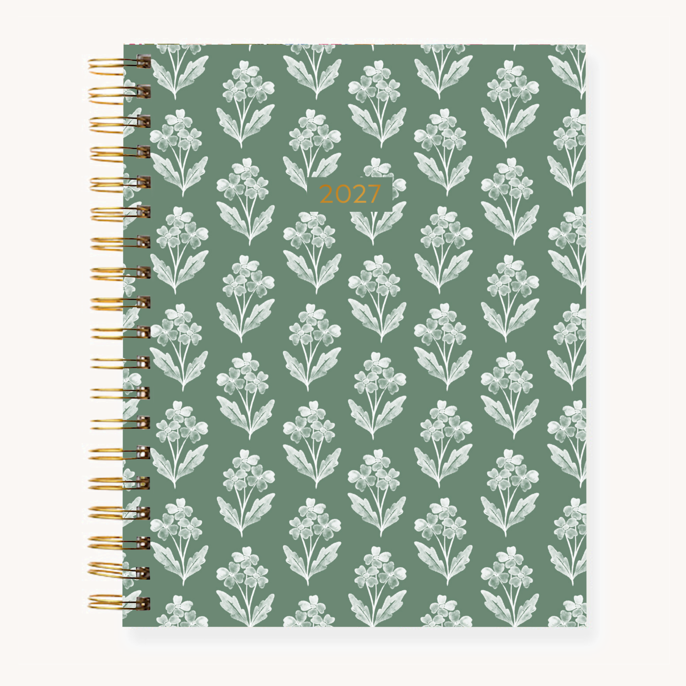

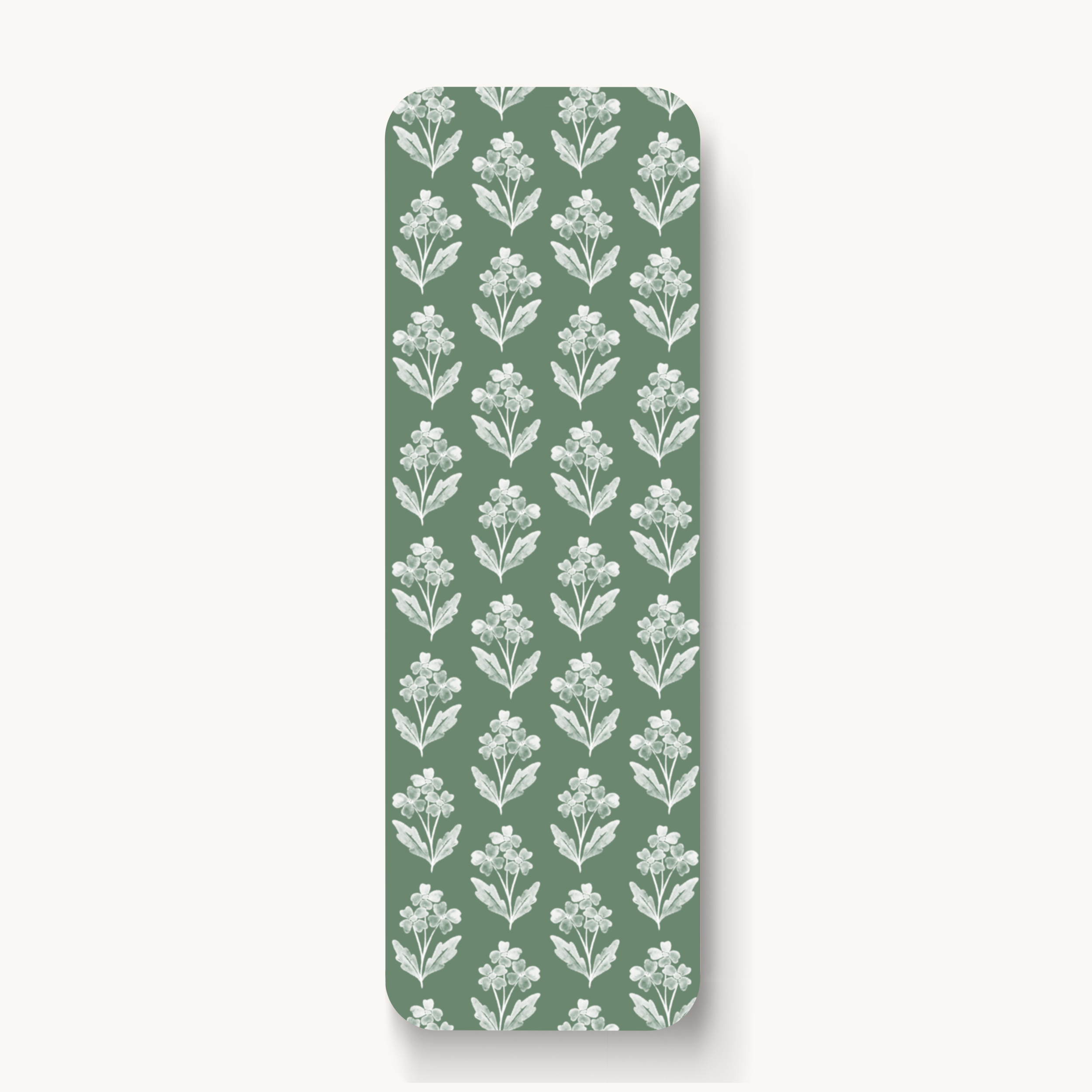
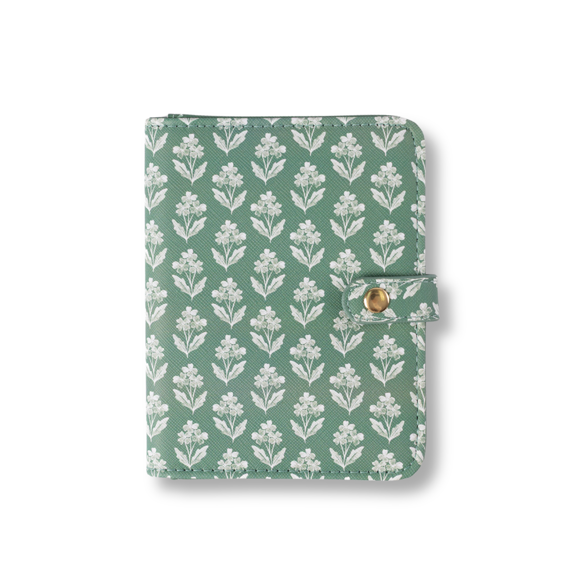
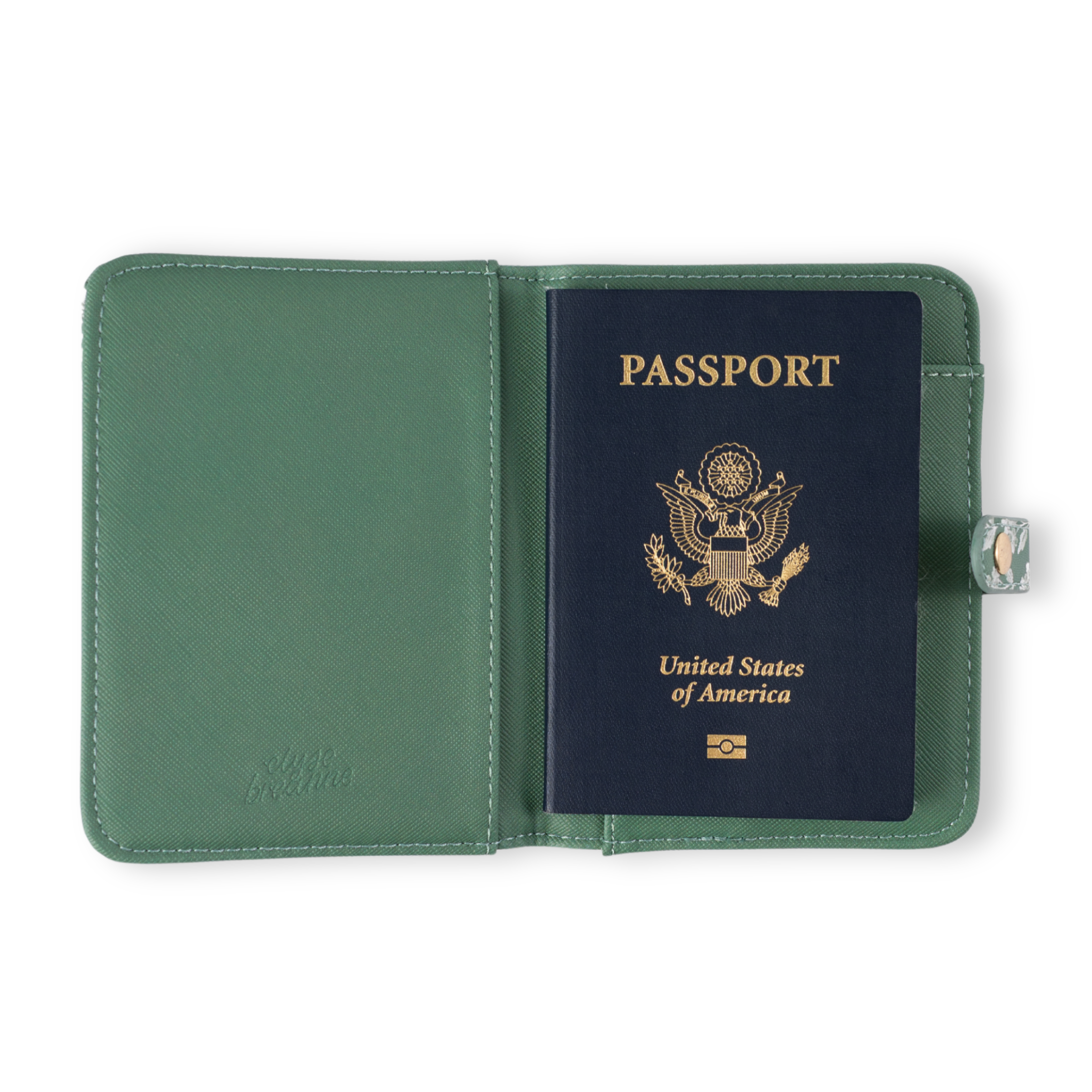

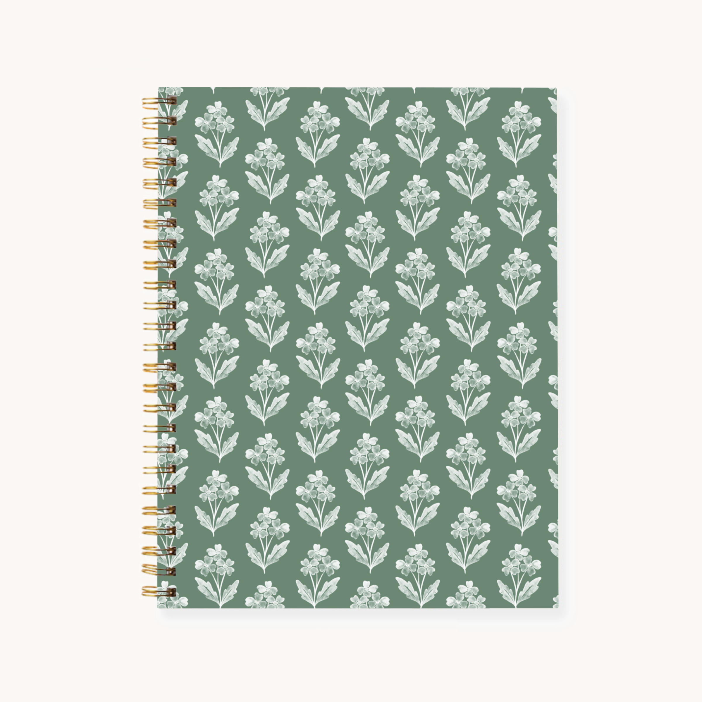

This sweet & simple pattern actually caused a major divide in our office. Forget Me Nots started out with blue flowers on a white background, and then had green flowers on a white background, and then a host of background colors with white flowers, before we settled on this sage green. Forget Me Nots made its debut on our 2025-2026 Academic Planners. I decided it would be included in that season of planners on a whim, and wasn't even settled on what color it should be. I asked around in the office, eventually drawing everyone around my desk looking at my screen. We wanted a color that would appeal to a different audience than our usually bright, rainbow palettes. While I and some of the gals in the office were very drawn to a mustard yellow background, and briefly tempted to use chartreuse (probably my personal favorite color), I listened to the faction that had formed in enthusiastic support of the sage option. It might be the only time I've felt a true tension in our office, since everyone had become very passionate, very quickly about their preferred color for this design. The pro-sage group turned out to be completely right about that color: Forget Me Nots have become a huge hit with EBD customers since its debut, and it's hard to imagine the brand without it now!