

Beginner’s Tips for Lettering in Procreate

I’m the type of person who presses down so hard on my pen that you see the indentations of what I wrote in a notebook on the following page. I’m not exactly sure why I feel the need to push down so firmly when I write, but I think that it gives me more stability so that I can make cleaner strokes. Anyway, this habit, as I’m sure you can imagine, is not so compatible with trying to write and draw on an iPad with an Apple Pencil. Since I can’t press down into the glass screen like I can with a pen and notebook, there was definitely a learning curve that came with starting to use my iPad for lettering.
When I first got my iPad, I immediately downloaded the app Procreate (which is a really incredible application, especially considering it’s only $10). I started off trying to letter a classic: the word “hello” (inventive, I know) and I expected it to look crisp, clean and polished right away, with the downstrokes evenly thicker than the rest of the smoothly curved lines. And of course, that didn’t happen. The word looked more like how I imagine my first attempt at lettering turned out using Microsoft Paint circa 2003. Since, then, I’ve learned some tips and tricks for getting my lettering a little closer to that Instagram-worthy, smooth-and-steady ideal, and I’m here to share them with you!
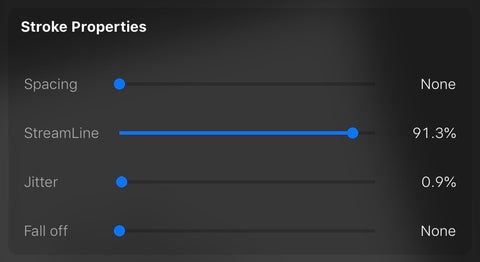
1. STREAMLINE. Ok, I know that all caps are really aggressive, but I think it’s justified because this point is THAT important. There is an amazing feature adjustable for all Procreate brushes called streamline. When you increase the streamline percentage on a brush, that brush will automatically smooth out your lines to make them appear more, you guessed it, streamlined. It’s a fantastic feature for lettering, because it can take this:

and make it look like this:

It’s great because it is very easy to lower the streamline percentage if you’re using a brush for drawing or sketching, and then change it back to a higher setting for lettering. I recommend playing around with the feature at different levels so you can get a feel for how it behaves and how it alters the strokes you make. I tend to set all of my lettering brushes to a really high streamline percentage—usually around 80 or 90 percent—because my hands really aren’t that steady, and I tend to letter relatively slowly. And that brings me to my second point.
2. Speed. The speed at which you letter will drastically alter the results you see. Lettering at a very slow pace will produce shakier strokes, while going too quick may leave you with haphazard or imprecise strokes. Obviously, practicing will help you find the speed that gives you the write mix of precision and stability. I recommend trying out different brushes at different speeds and different streamline settings. If you go quicker, you can set you streamline to be a bit lower (maybe around 60). If you’re slow like me, I’d try setting it somewhere around 80. Practicing will also help you get faster at creating each stroke, which is good because if you go too slow, your letter will probably look a little disjointed and messy (not to mention it’s inefficient). That’s why repetition is so important, it’s really the only way to go fast enough to make smooth and even letters while also producing the style and shape you’re going for.

3. Angle. The Apple Pencil is truly a remarkable tool. It can sense the pressure you’re putting on the screen and the angle at which you’re holding it. Some Procreate brushes utilize these abilities, while others don’t. For example, the sketching brushes are sensitive to angle and pressure, while most of the calligraphy brushes only utilize pressure. The monoline brush that comes preloaded with the application is a great tool because it ignore both angle and pressure, giving you even & solid lines. You can use this brush for lettering, but if you’re looking to take your lettering to the next level, it’s smart to practice with some of the pressure sensitive brushes. Calligraphy, both traditional and modern, has the polished professional look in part because of the thicker downstrokes. Every time the writer is moving their pen toward the bottom of the page or surface, they’re creating a downstroke. To achieve that variety of thickness, a lot of people will use faux calligraphy, where you write a word out and then go back and thicken the downstrokes after the fact. This is great for markers and pens, but it’s slower and usually looks just a little less polished (in my opinion). Since the Apple Pencil is pressure sensitive, you can use certain Procreate brushes to create the same effect quickly and easily the first time you letter a word. It takes a lot of practice to evenly apply the right amount of pressure at the right times, but using the right brush and holding your Apple Pencil at the right angle can help. I recommend starting not with the “script” calligraphy brush (it is extremely sensitive), but with the “streaks” brush (which can be found under the calligraphy section), at least to start out.

I started with this brush and it was perfect for me other than the texture of it, Now, I use my own custom brush that I absolutely love. If you’re interested, you can find it by clicking the image below.


Leave a comment